How to use pgfplots in Latex
This article introduces a few commonly used methods for plotting in latex. In this way, there is no need to save picture and include it. Every time when you change your numerical experiment, to update the plot, just need to update the data file.
Before we start, the following packages and command are useful:
\usepackage{tikz} % To generate the plot from csv
\usepackage{pgfplots}
\pgfplotsset{compat=1.5}
Plotting data from .dat files in LaTeX
Using \addplot table
Ploting data directly from a .dat file.
For example, if a file called data.dat has the data table shown as follows:
x	f(x)
3.16693000e-05	-4.00001451e+00
1.00816962e-03	-3.08781504e+00
1.98466995e-03	-2.88058811e+00
2.96117027e-03	-2.75205040e+00
3.93767059e-03	-2.65736805e+00
4.91417091e-03	-2.58181091e+00
5.89067124e-03	-2.51862689e+00
6.86717156e-03	-2.46413745e+00
....
Using the following commands can generate the plots automatically.
\begin{tikzpicture}
    \begin{axis}[
    	title = {Picture 1},  % whatever name you want
    	xlabel = {$x$},
    	ylabel = {$y$},
    	ymin = -3, ymax = 3,
    	minor y tick num = 1,
    	]
    	\addplot[blue] table {data.dat};
    \end{axis}
\end{tikzpicture}
Then the corresonding plot will be:
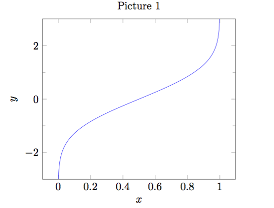
REMARK:
\begin{axis}... \end{axis}is the environment for a normal axis.- Axis descriptions can be added using the keys
title,xlabel,ylabelas we have in our example listing. - The keys
ymin,ymax,xmin,xmaxcontrol only the visible part, i.e., the axis range. - The third new option is
minor y tick num = 1which allows to customize minor ticks. \addplot[blue]means that the plot will be placed in blue color,\addplot tableloads a table from a file and plots the first two columns. The keywordtablealso accepts an option list (for example, to choose columns, to define a differentcol seporrow sepor to provide some math expression which is applied to each row).
Using \addplot expression
Of course, we can also use another way to generate a plot.
More precisely, \addplot expression can make it.
For example:
\begin{tikzpicture}
    \begin{axis}
		% density of Normal distribution:
		\newcommand\MU{0}
		\newcommand\SIGMA{1e-3}
		\addplot[
			red,
			domain = -3*\SIGMA: 3*\SIGMA,
			samples = 201,
			]
			{exp(-(x-\MU)^2 / 2 / \SIGMA^2) / (\SIGMA * sqrt(2*pi))};
	\end{axis}
\end{tikzpicture}
The above commands can obtain the following plot:
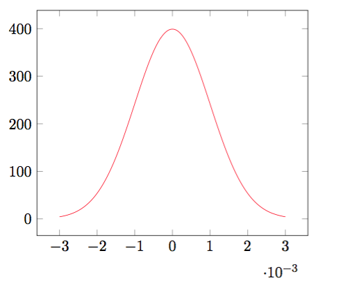
REMARK:
domaindefines the sampling interval in the form a:b.samples = Nexpects the number of samples inserted into the sampling interval.- Here the
expressionis the density of Normal distribution.
Dealing with multiple files simultaneously
We can read several data files at the same time and then plot them into one picture. For example, if we have three data files, each of them corresponds to one parameter d, which could be 2, 3 or 4. The data file for d = 2 is stored in data_d2.dat and it contains the following data:
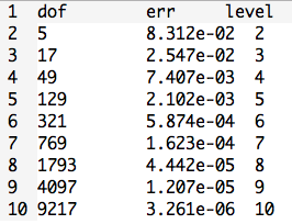
The other files are similar.
If we wnat to produce a loglog plot, the following commands can make this happen:
\begin{tikzpicture}
    \begin{loglogaxis}[
    	title = {Convergence Plot},
    	xlabel = {Degrees of freedom},
    	ylabel = {$L_2$ Error},
    	grid = major,
    	legend entries = {$d=2$, $d=3$, $d = 4$},
    	]
    	\addplot table {data_d2.dat};
    	\addplot table {data_d3.dat};
    	\addplot table {data_d4.dat};
    \end{loglogaxis}
\end{tikzpicture}
Here is the result:
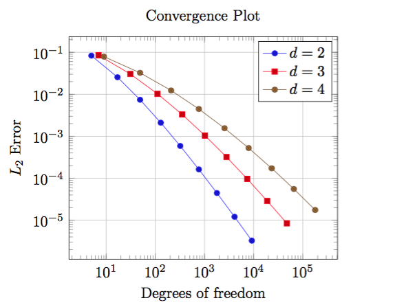
REMARK:
- We used
\begin{loglogaxis}instead of\begin{axis}in order to configure logarithmic scales on both axes. - The plot contains grid lines since we used the
grid = majorkey. - A legend can be provided for one or more
\addplotstatements using thelegend entrieskey. pgfplotsaccepts more than one\addplot ... ;command, so we can just add our remaining data files.- We do not need to worry about the line styles, since
pgfplotswill automatically choose styles for that specific plot.
3D Scatter Plots
This is similar to two dimensional plot.
For example, if we have a file called data_3d.dat which contains the following data:
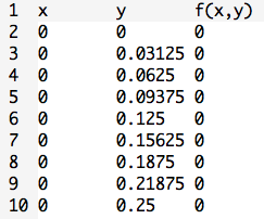
Using the below commands can obtain the desired plot:
\begin{tikzpicture}
    \begin{axis}[
        xlabel = $x$,
        ylabel = $y$,
        zlabel = {$f(x,y) = x \cdot y$},
        title = {A Scatter Plot Example},
        ]
        \addplot3+[only marks, scatter] table {data_3d.dat};
    \end{axis}
\end{tikzpicture}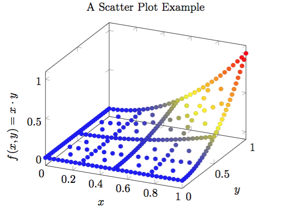
REMARK:
- The
\addplot3command is the main interface for any three dimensional plot. only marksplaces the current plot mark at each input position.- If we add the key
scatter, the plot mark will also use the colors of the currentcolormap.
Plotting data from .csv files in LaTeX
Similar to .dat file, we can also use \addplot table to import data from .csv file.
Let’s use the previos skills to deal with a relatively more complex example.
Here is data from data.csv file:
| people | probability |
|---|---|
| 0 | 0.000000 |
| 1 | 0.000000 |
| 2 | 0.002740 |
| 3 | 0.008204 |
| 4 | 0.016356 |
| 5 | 0.027136 |
| … | … |
Then the following commands can help us obtain the below plot:
\begin{tikzpicture}
    \begin{axis}[
        width=15cm, height=8cm,     % size of the image
        grid = major,
        grid style = {dashed, gray!30},
        % xmode=log,log basis x=10,
        % ymode=log,log basis y=10,
        xmin = 0,     % start the diagram at this x-coordinate
        xmax = 62,    % end   the diagram at this x-coordinate
        ymin = 0,     % start the diagram at this y-coordinate
        ymax = 1.1,   % end   the diagram at this y-coordinate
        /pgfplots/xtick = {0,5,...,60}, % make steps of length 5
        extra x ticks = {23},
        extra y ticks = {0.507297},
        axis background/.style = {fill=white},
        ylabel = {probability of at least one birthday-collision},
        xlabel = {people},
        tick align = outside,
        ]

		% import the correct data from a CSV file
		\addplot table {data.csv};

		% mark x=23
		\coordinate (a) at (axis cs:23, 0.507297);
		\draw[blue, dashed, thick](a -| current plot begin) -- (a);
		\draw[blue, dashed, thick](a |- current plot begin) -- (a);

		% plot the stirling-formulae
		\addplot[domain=0:60, red, thick] {1-(365/(365-x))^(365.5-x)*e^(-x)};
	\end{axis}
\end{tikzpicture}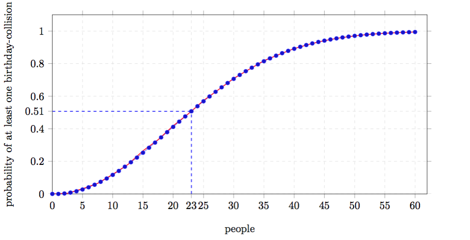
For more details about the package pgfplots, please download the pdf tutorial Manual for Package PGFPLOTS as a reference.